
BuddhistCatholicContemplativeEvangelicalGeneral ChristianHinduJewishLatter-day SaintMuslimNew VisionsProgressive Christian
Beliefs
- Buddhist
- Catholic
- Contemplative
- Evangelical
- General Christian
- Hindu
- Jewish
- Latter-day Saint
- More Voices
- Muslim
- New Visions
- Pagan
- Progressive Christian
Topics
- Religion News
- Food and Religion
- Sports and Religion
- Religious Art
- Religious Music and Entertainment
- Religious Events
- History and Religion
- Style and Religion
- Politics and Religion
- Women in Religion
- Recreation Outdoors and Religion
- Business Finance and Religion
- Careers Workplace and Religion
- Education and Religion
- Family Parenting and Religion
- Health Fitness and Religion
- Home and Religion
- Relationships and Religion
- Technology and Religion
- Travel and Religion
Columnists
- Buddhist Columnists
- Business Finance and Religion Columnists
- Careers Workplace and Religion Columnists
- Catholic Columnists
- Contemplative Columnists
- Education and Religion Columnists
- Evangelists Columnists
- Family Parenting and Religion Columnists
- General Christian Columnists
- Health Fitness and Religion Columnists
- Hindu Columnists
- History and Religion Columnists
- Home and Religion Columnists
- Jewish Columnists
- More Voices Columnists
- Latter Day Columnists
- Muslim Columnists
- New Visions Columnists
- Nonreligious Columnists
- Pagan Columnists
- Politics and Religion Columnists
- Progressive Columnists
- Recreation Outdoors and Religion Columnists
- Relationships and Religion Columnists
- Religion News Columnists
- Religious Art Columnists
- Religious Events Columnists
- Religious Music and Entertainment Columnists
- Sports and Religion Columnists
- Style and Religion Columnists
- Technology and Religion Columnists
- Travel and Religion Columnists
- Women in Religion Columnists
Resource Library
- 2026 Calendar
- Library of World Religions
- The 100 Most Holy Places on Earth
- Patheos Answers
- Podcasts
- Videos
- Faith Leaders Database
- Anglican Episcopalian
- Bahai
- Baptist
- Buddhism
- Christianity
- Confucianism
- Eastern Orthodoxy
- Hinduism
- Holiness and Pentecostal
- ISKCON
- Islam
- Judaism
- Lutheran
- Methodist
- The Church of Jesus Christ of Latter-day Saints
- New Age
- Paganism
- Presbytarian and Reformed
- Protestantism
- Religion Behind the Scenes
- Roman Catholic
- Scientology
- Shia Islam
- Sikhism
- Sufism
- Sunni Islam
- Taoism
- Zen
- See all religions
Research Tools
 Ad-Free & Subscriber Log-In Subscription Support
Ad-Free & Subscriber Log-In Subscription Support
Follow Patheos 

- Trending:
- Forgiveness
- |
- Marriage
- |
- Consciousness
- |
- Death Penalty
- |
- Election
- |
- Halloween

- Home
- Pagan
- 7 Secrets to Design Witchery
7 Secrets to Design Witchery
Last updated on: June 13, 2017 at 3:49 pm by Laura Tempest Zakroff
7 Secrets to Design Witchery 2017-06-13T15:49:25-08:00 Laura Tempest Zakroff
Patheos Explore the world's faith through different perspectives on religion and spirituality! Patheos has the views of the prevalent religions and spiritualities of the world.
You might not think there’s magick in graphic design, but you’d be very much mistaken. The whole purpose of good design is to draw the eye, get people involved or interested, and create some sort of successful interaction from it all. While graphic design may not exactly be spellcraft (though you sure can work some sigils into it, or apply colors in a sympathetic manner), it can be a vital thing to the business of Witchcraft – and Pwordism in general.
Want people to know about your event? It needs a good graphic, an easy to read flyer, something that captures the eye and gets people to read. It needs to be distinctive, yet clean and attractive. It also needs to seem current to your target audience. Unfortunately, a lot of the event flyers and ads I’ve seen recently look like they’ve taken inspiration from 1990’s websites a la geocities gif-frenzy/graphic overload. As if the mode of thinking is: more is more, and better if you can’t actually read the thing. Witchy does not mean include every magicky graphic ever.
I’m not going to embarrass anyone by pointing out their flyers or websites. Heck, I’ve had a few over the years that I would prefer to delete from the design folder of history. I could make a tumblr of bad design examples that would keep me busy every day for years. Let’s not focus on that. Instead, let’s start making some awesome ads!
I can’t claim to be on the cutting edge of what’s hot in graphic design (I’m 20 years past school for that, though I’m good at spotting trends) – BUT I know what works, and have some simple guidelines to follow. So if you have an event or shop or thing you want to promote, and are going to fire up Photoshop, paintshop, gimp, word, or whatever you use to make a flyer, here’s some tips to follow that will steer you well.
(In no particular order, they’re all important):
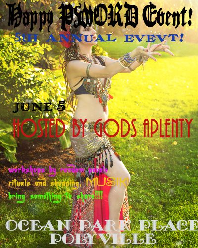
Use no more than 3 fonts on a single piece of advertising. That includes your logo. So if you have a name logo, that’s one font. Then you could choose an additional font for headlines, and one more for text/small print – that is easier to read. And you’ve hit your limit. Sans Serif fonts (like Arial, Helvetica, Verdana) are best for small type, as they’re clean (think “sans decoration”). Serif fonts are fancier, so they are more for grabbing the eye. Look for fonts that are easy to read versus look cool. Cool points don’t matter if you can’t read it!
Do not use busy graphics as your background image. Yes, that is a lovely picture of faeries tripping, unicorns jousting, or naked maypole dancing – but don’t use it behind your text. Nobody can read anything you put on top of it, no matter what color you use. It hurts the eyes and makes people less likely to keep reading.
If you do use an image, make sure you have permission to use it. “I found it on google image search” does not mean it’s free for you to use. Ask permission of the artist/photographer/designer, or invest in stock images. Don’t be that jerk who says “well, easier to say I’m sorry…”
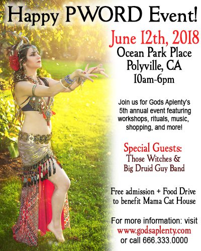
Does your ad satisfy the who/what/when/where/why? Meaning if it’s an event, who does it involve, what’s happening, when and where is it happening (day/date/year), and any other important details (website/email/complete phone number/reservations/tickets/etc). Especially for things on the web – put city/state! If it’s get spread, then people can know where it’s happening, and share it in the right places.
Consider your color scheme. If you want something to stand out and “vibrate”, use complementary color variations (blue/orange, yellow/purple, red/green). You can also do mainly monochromatic (one color) with a pop of something else to catch the eye. If you’re looking for something more harmonious, choose analogous colors (they’re next to each other on the color wheel – check out the link for more color theory help).
But KEEP IT SIMPLE. Too much text/information makes it hard to read. If it’s a flyer, direct them to a website or phone number where they can get more information. Don’t repeat text over and over. More graphics is NOT better. Less graphics make it more attractive to the eye and easier to read. White or open space is totally OK!
For the love of the gods, SPELLCHECK and PROOFREAD. Are you bad with typing stuff out and your layout program doesn’t let you know if you’ve made a typo? Then put all of your text first into a document of some kind (Open Office has a great collection of free word/spreadsheet/presentation programs you can download), check the spelling, and then re-read it to make sure it makes sense. Then read it again, and again. Then have something else look at it again. Then read it out loud to your cat. That helps.
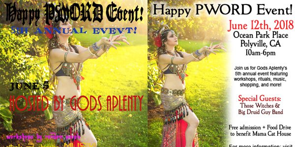
The following examples I created in about 10 minutes (total). Photo is of me, by Carrie Meyer of The Dancer’s Eye. I could go back and tweak them more, but they’re a quick example of what not to do, and what to do. Obviously one is much easier to read and has most, if not all, of the relevant info on there. Basically, the right combination of elements equals the right ingredients to a successful design – just like magick that works.
Bad Idea
good idea
Previous Post
June 12, 2017
The Biggest Cauldron You Ever Did See...
Next Post

June 15, 2017 In Which I Am Possibly A Bad Witch....
Browse Our Archives
Select a Category Art Books cats cauldron month community contest Events home Metaphysics Modern Practice Movement Myth & Folklore satire sigils Tradition travel Uncategorized video
Select a Month May 2026 March 2026 January 2026 September 2025 August 2025 April 2025 March 2025 February 2025 January 2025 December 2024 November 2024 October 2024 August 2024 June 2024 May 2024 March 2024 February 2024 January 2024 December 2023 November 2023 October 2023 September 2023 August 2023 July 2023 June 2023 February 2023 December 2022 November 2022 September 2022 July 2022 May 2022 February 2022 January 2022 December 2021 October 2021 September 2021 August 2021 July 2021 June 2021 May 2021 April 2021 March 2021 February 2021 January 2021 December 2020 November 2020 October 2020 September 2020 August 2020 July 2020 June 2020 May 2020 April 2020 March 2020 February 2020 January 2020 December 2019 November 2019 October 2019 September 2019 August 2019 July 2019 June 2019 May 2019 April 2019 March 2019 February 2019 January 2019 December 2018 November 2018 October 2018 September 2018 August 2018 July 2018 June 2018 May 2018 April 2018 March 2018 February 2018 January 2018 December 2017 November 2017 October 2017 September 2017 August 2017 July 2017 June 2017 May 2017 April 2017 March 2017 February 2017 January 2017 December 2016 November 2016 October 2016 September 2016 August 2016 July 2016 June 2016 May 2016 April 2016 March 2016
Follow Us!
TAKE THE
Religious Wisdom Quiz
Who was Jephthah's daughter?
Select your answer to see how you score.
Ruth Miriam Unnamed Deborah
Related posts from A Modern Traditional Witch
Cuddling the Universe: The Joy of Derpy
Magic That Moves The World...Starts With You

The Medusa Sigil & Full Moon Working
TRENDING AT PATHEOS Pagan

I was recently chatting with someone on Instagram. She asked me what...

While there are many people who share their results, the end of...

On July 23, I saw Christopher Nolan's The Odyssey which is Homer’s...

As I write this two big events have just finished up. One...
Restoring the Watershed of Divine Love
Perhaps cooperation is not something we manufacture through legislation, ideology, or moral...

Many UUs don’t pray because of bad experiences in a previous religion,...
view all Pagan blogs
Ad-Free & Subscriber Log-In Subscription Support
- About Us
- 2026 Calendar
- Videos
- Podcasts
- Library of World Religions
- Faith In Media Tracker
- Advertise With Us
- Write for Us
- Privacy Policy
- Terms of Service
- Do Not Sell My Data
- Contact Us
- Radiant Digital
- Manage Newsletter Subscriptions
- Unsubscribe From Notifications
- Sitemap
Copyright 2008-2026, Patheos. All rights reserved.
Subscription Support Ad-Free & Subscriber Log-In
Follow Patheos