
BuddhistCatholicContemplativeEvangelicalGeneral ChristianHinduJewishLatter-day SaintMuslimNew VisionsProgressive Christian
Beliefs
- Buddhist
- Catholic
- Contemplative
- Evangelical
- General Christian
- Hindu
- Jewish
- Latter-day Saint
- More Voices
- Muslim
- New Visions
- Pagan
- Progressive Christian
Topics
- Religion News
- Food and Religion
- Sports and Religion
- Religious Art
- Religious Music and Entertainment
- Religious Events
- History and Religion
- Style and Religion
- Politics and Religion
- Women in Religion
- Recreation Outdoors and Religion
- Business Finance and Religion
- Careers Workplace and Religion
- Education and Religion
- Family Parenting and Religion
- Health Fitness and Religion
- Home and Religion
- Relationships and Religion
- Technology and Religion
- Travel and Religion
Columnists
- Buddhist Columnists
- Business Finance and Religion Columnists
- Careers Workplace and Religion Columnists
- Catholic Columnists
- Contemplative Columnists
- Education and Religion Columnists
- Evangelists Columnists
- Family Parenting and Religion Columnists
- General Christian Columnists
- Health Fitness and Religion Columnists
- Hindu Columnists
- History and Religion Columnists
- Home and Religion Columnists
- Jewish Columnists
- More Voices Columnists
- Latter Day Columnists
- Muslim Columnists
- New Visions Columnists
- Nonreligious Columnists
- Pagan Columnists
- Politics and Religion Columnists
- Progressive Columnists
- Recreation Outdoors and Religion Columnists
- Relationships and Religion Columnists
- Religion News Columnists
- Religious Art Columnists
- Religious Events Columnists
- Religious Music and Entertainment Columnists
- Sports and Religion Columnists
- Style and Religion Columnists
- Technology and Religion Columnists
- Travel and Religion Columnists
- Women in Religion Columnists
Resource Library
- 2026 Calendar
- Library of World Religions
- The 100 Most Holy Places on Earth
- Patheos Answers
- Podcasts
- Videos
- Faith Leaders Database
- Anglican Episcopalian
- Bahai
- Baptist
- Buddhism
- Christianity
- Confucianism
- Eastern Orthodoxy
- Hinduism
- Holiness and Pentecostal
- ISKCON
- Islam
- Judaism
- Lutheran
- Methodist
- The Church of Jesus Christ of Latter-day Saints
- New Age
- Paganism
- Presbytarian and Reformed
- Protestantism
- Religion Behind the Scenes
- Roman Catholic
- Scientology
- Shia Islam
- Sikhism
- Sufism
- Sunni Islam
- Taoism
- Zen
- See all religions
Research Tools
 Ad-Free & Subscriber Log-In Subscription Support
Ad-Free & Subscriber Log-In Subscription Support
Follow Patheos 

- Trending:
- Forgiveness
- |
- Marriage
- |
- Consciousness
- |
- Death Penalty
- |
- Election
- |
- Halloween
 Diary of a Wimpy Catholic
- Home
- Catholic
- Splitting the Difference on the Mercy Logo
Splitting the Difference on the Mercy Logo
Last updated on: May 10, 2015 at 9:10 pm by Max Lindenman
Splitting the Difference on the Mercy Logo 2015-05-10T21:10:33-06:00 Max Lindenman
Patheos Explore the world's faith through different perspectives on religion and spirituality! Patheos has the views of the prevalent religions and spiritualities of the world.
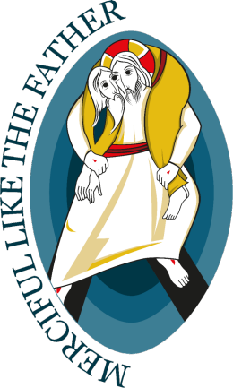
Yes, the logo for the Year of Mercy is an eyesore — and that’s if you’re smart enough to look away after giving it a quick glance. Woe betide those who look twice: they run the risk of being hypnotized. Jesus‘ limbs seem to be made of rubber. Dainty pinpricks represent the wound he sustained on the cross. He and Adam, the burden he’s carrying, have just three eyes between them, all of which look to have been plucked from a My Little Pony.
One translation of Paraclete is advocate, which means that everyone and everything deserves a good lawyer. Billy Kangas does his best to plead for the logo, but on the whole I have to agree with Tom and Simcha: the Vatican should have sandbagged it for the next time it declares a Year of Trippiness.
Since it’s too late for anyone to recall and replace the thing, we might as well rule it a minor fail and take a lesson from it: When it comes to sacred art, there are many kinds of bad. One kind shows the artist’s lack of imagination or unwillingness to engage seriously with his subject. You get the sense that he was going through the motions for the sake of a paycheck. This phenomenon probably accounts for most of the bare, barnlike churches that Katrina Fernandez loves to complain about.
Another variety of bad settles for boring and bland because that’s what the situation calls for. This would describe the entire world of Catholic kitsch. You don’t like the Divine Mercy image, or that prayer card where St. Thérèse comes off looking like a kewpie doll? Just thank Aunt Margaret for the confirmation present and stick it in a closet. You want great art? Go to Florence, cheapskate.
But there’s another kind of bad that I like to call noble bad. It results when an artist gets so carried away with his subject, or succumbs so thoroughly to the ecstasy of creation, that he ends up taking leave of his judgment. In his struggle to make whatever statement he wants to make, he takes risks he should have avoided and combines motifs, media, and colors that he really ought to have left separate.
I can think of an example of this very close to home. The adoration chapel of a certain north Scottsdale church displays the host in a portal carved from the trunk of a dead saguaro cactus. By itself, this wouldn’t be terrible – there’s lots to be said for harmonizing with the surrounding desert. The trouble starts with the Turkish rug. And the potted plants. And the chandelier. And the statues of kneeling angels, each the size of a healthy first grader.
The effect of this mix-and-match in a structure enclosed by glass on three sides has something of Vegas. It also has something of a serial killer’s private shrine. Either way, it makes the act of keeping watch with the Lord even harder than it normally is. But this is Scottsdale, the goyish Ft. Lauderdale, God’s waiting room. It’s easy to picture the furnishings being chosen by a brigade of volunteer doyennes who cheered each other on, believing with all their hearts that the knicknacks looked just darling and gave the place a homey feel.
I’m inclined to think that Marco Rupnik, the Jesuit priest who designed the logo, lost his head in a similar way. He approached the project with enormous goals, wanting on one hand to allude to the verse in Luke where the Good Shepherd carries the lost sheep on his shoulders, and on the other to depict Christ triumphant over the gates of hell. Trying to fit all of that into a single image, working in strokes broad enough to come through in a Facebook news feed, would whip anyone into a fever.
That fever could already have taken hold when Rupik went to work on the merged eye. As he told the press, he meant to show that “Christ sees with the eyes of Adam, and Adam with the eyes of Christ.” The idea may be too sophisticated to convey without words, but Rupnik’s stab is nothing if not arresting. (May one say “eye-catching”?)
If Rupnik fell short of his own goals, he did succeed in producing something that was bad in a truly noble way. Since this is the Year of Mercy, let’s all say, “Nice try.” And if he comes to visit, let’s stick his opus in a place where he’s sure to notice it.
Previous Post

May 8, 2015
Unfriending Jack Without Friending Bill
Next Post
May 11, 2015 Sic Transit Gloria Basset Hound
Browse Our Archives
Select a Category Uncategorized
Select a Month August 2016 July 2016 May 2016 April 2016 March 2016 January 2016 December 2015 November 2015 October 2015 September 2015 August 2015 July 2015 June 2015 May 2015 April 2015 February 2015 January 2015 July 2014 April 2014 February 2014 January 2014 December 2013 November 2013 October 2013 September 2013 August 2013 July 2013 May 2013 April 2013 March 2013 February 2013 January 2013 December 2012 November 2012 October 2012 September 2012 August 2012 July 2012 June 2012 May 2012 April 2012 March 2012 February 2012 January 2012 December 2011 November 2011 October 2011 September 2011 August 2011 July 2011 June 2011 May 2011
Follow Us!
TAKE THE
Religious Wisdom Quiz
What does the name "Bethlehem" mean in Hebrew?
Select your answer to see how you score.
House of Bread House of Stone House of Prayer House of Kings
Related posts from Diary of a Wimpy Catholic
Lent for the Reluctant Ascetic
Girls at the Altar: Decompressing A Condensed Symbol
Why Grow Up When You Can Be Christian?
TRENDING AT PATHEOS Catholic
Rejecting Doom: Christian Hope And Human Action
Christianity is a religion of hope. We are to have hope and...

It’s What Comes From Within Which Matters
One of the most difficult things for us to understand is why...
Why I Choose the Eucharist Over the Sermon
Choose the Eucharist, Not the Sermon What are we supposed to get...

5 Design Elements Found in Spiritually Rooted Homes
Putting Spirituality Into Home Decor Our homes are more than our living...
Credo: A Story of God Told with the...
About 10 years ago, I began to imagine a personal "Credo" that...
The Anatomy of Divine Revelation in Catholic Thought
The claim that God has made Himself known to human beings is...
view all Catholic blogs
Ad-Free & Subscriber Log-In Subscription Support
- About Us
- 2026 Calendar
- Videos
- Podcasts
- Library of World Religions
- Faith In Media Tracker
- Advertise With Us
- Write for Us
- Privacy Policy
- Terms of Service
- Do Not Sell My Data
- Contact Us
- Radiant Digital
- Manage Newsletter Subscriptions
- Unsubscribe From Notifications
- Sitemap
Copyright 2008-2026, Patheos. All rights reserved.
Subscription Support Ad-Free & Subscriber Log-In
Follow Patheos